Birkby Junior School
The Brief:
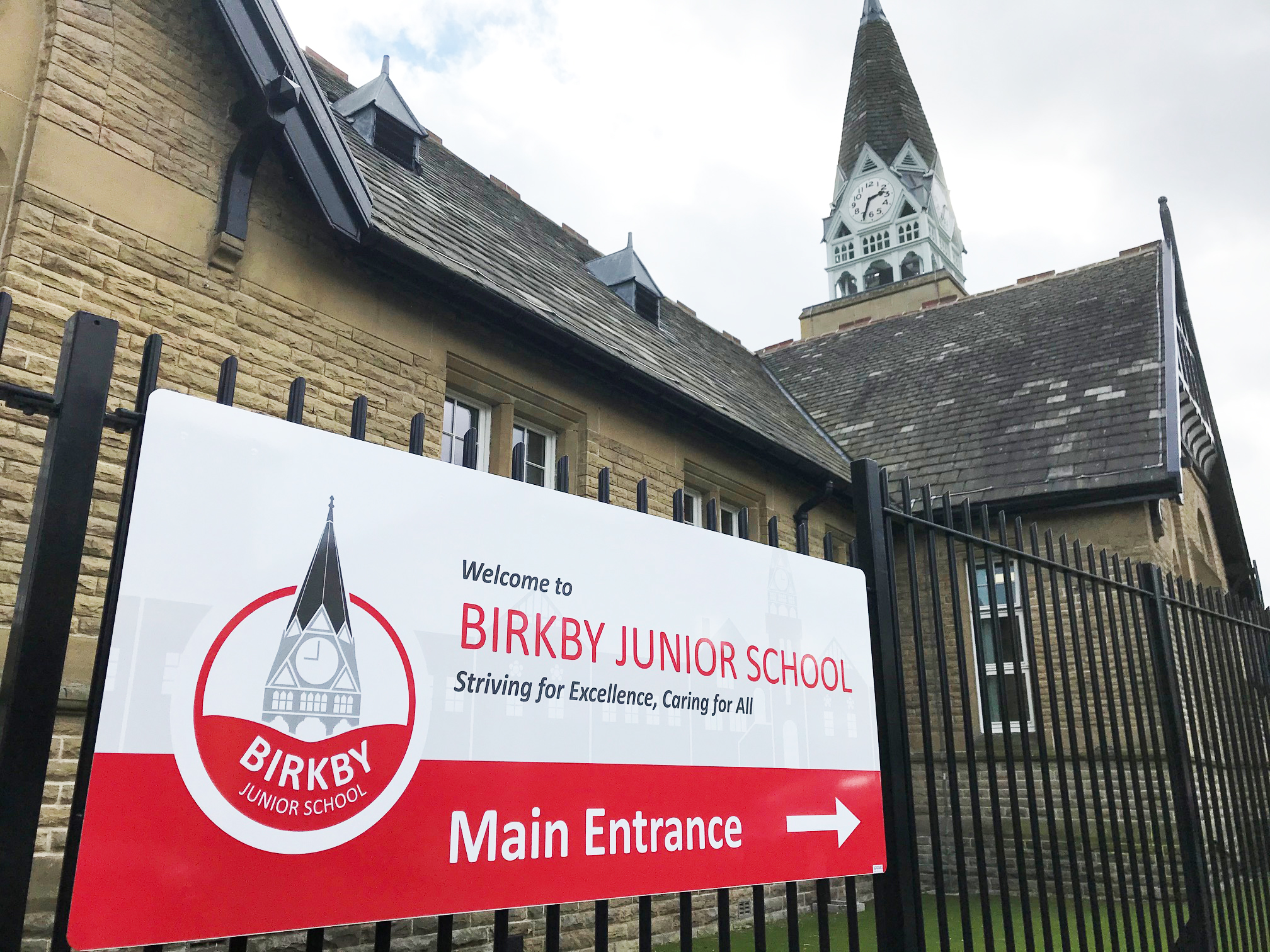
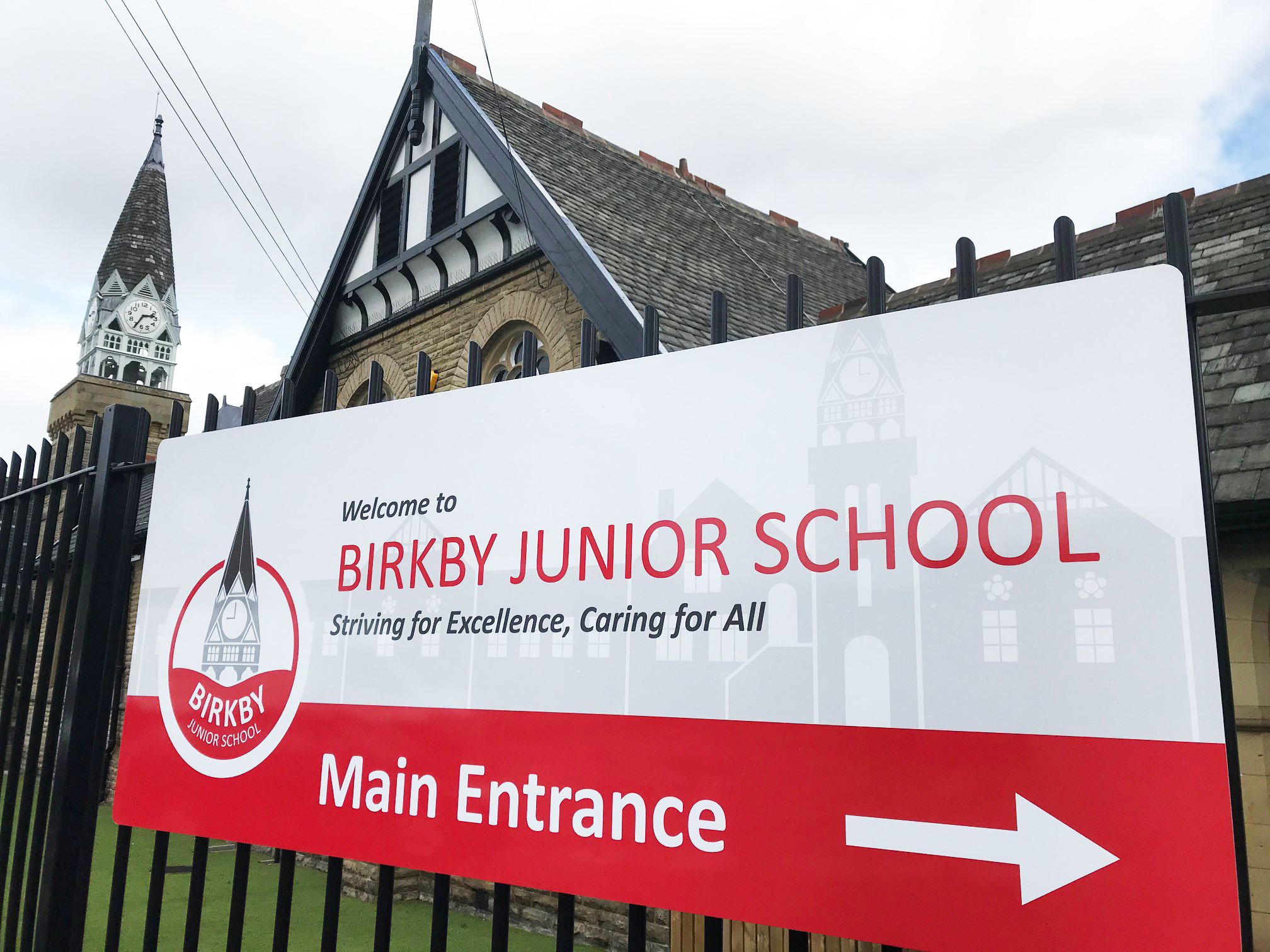
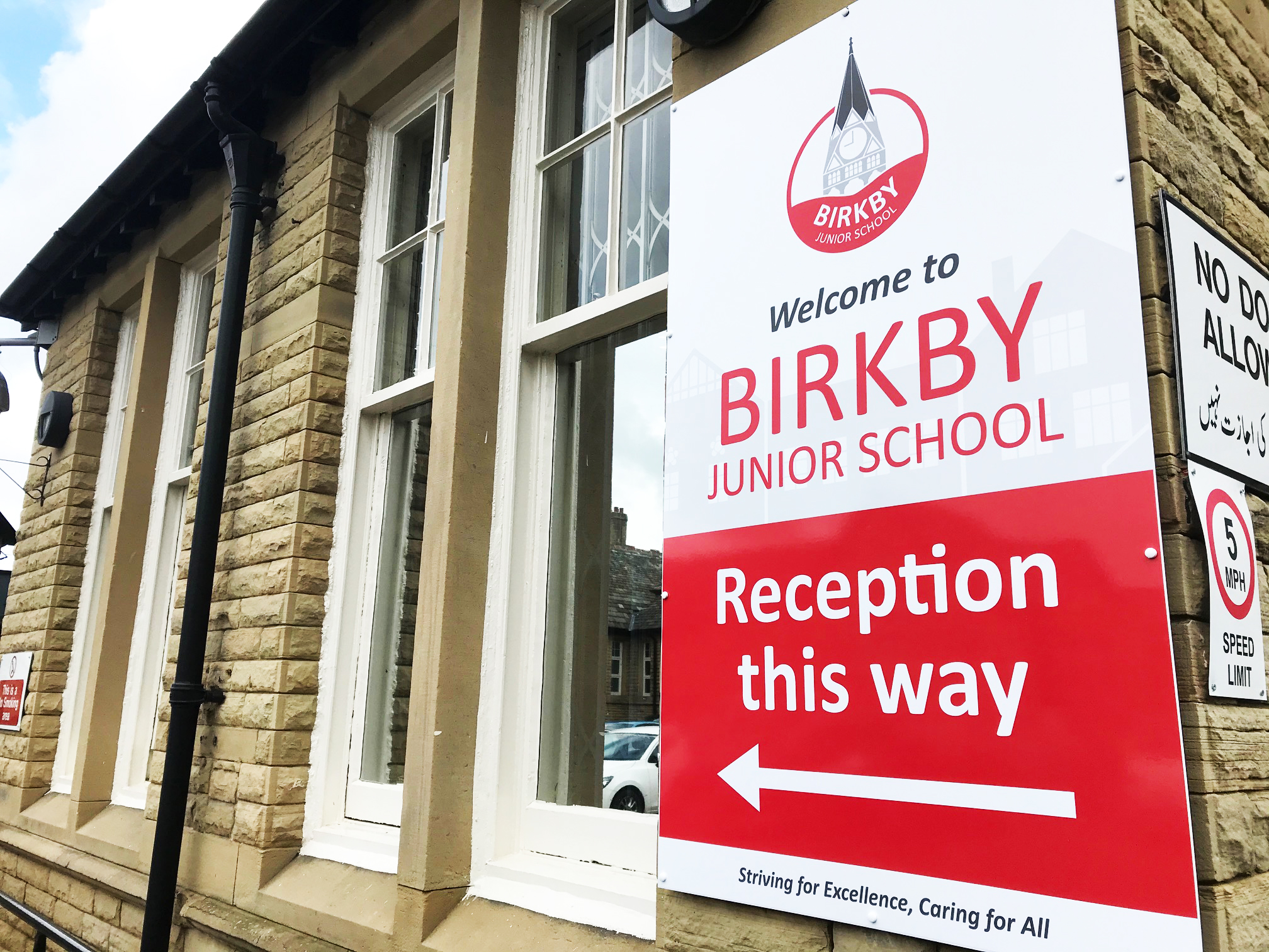
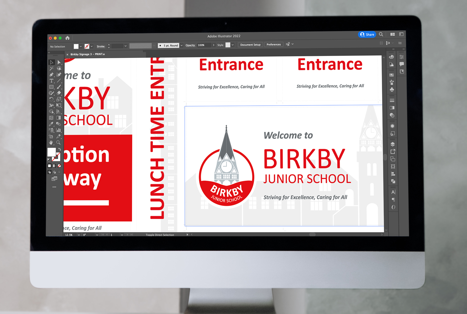
Birkby Junior School is a Huddersfield based school with a beautiful old building. They approached Space3 needing a new fresh, modern logo. They wanted it to be in line with their old logo, featuring their iconic clock tower. The branding also needed to feature red to match their school uniform. The school also needed new signage across the site, particularly to direct visitors to the correct place.
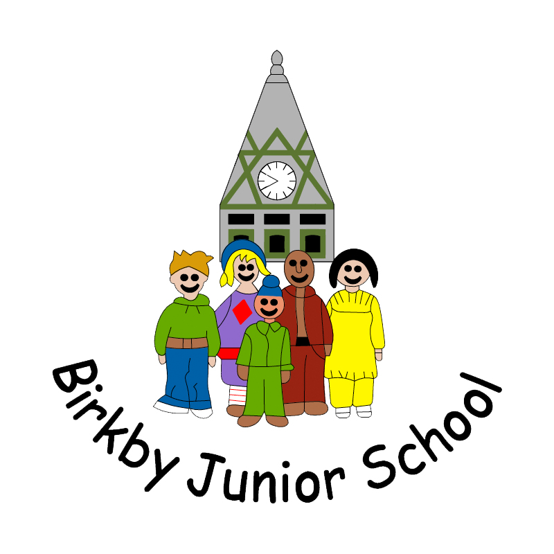
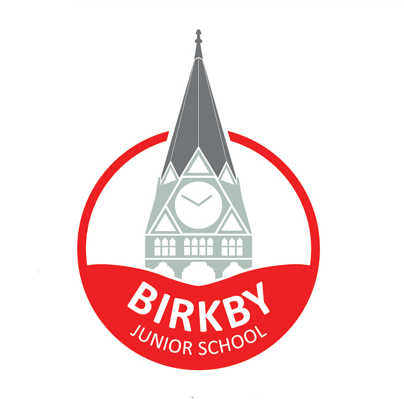
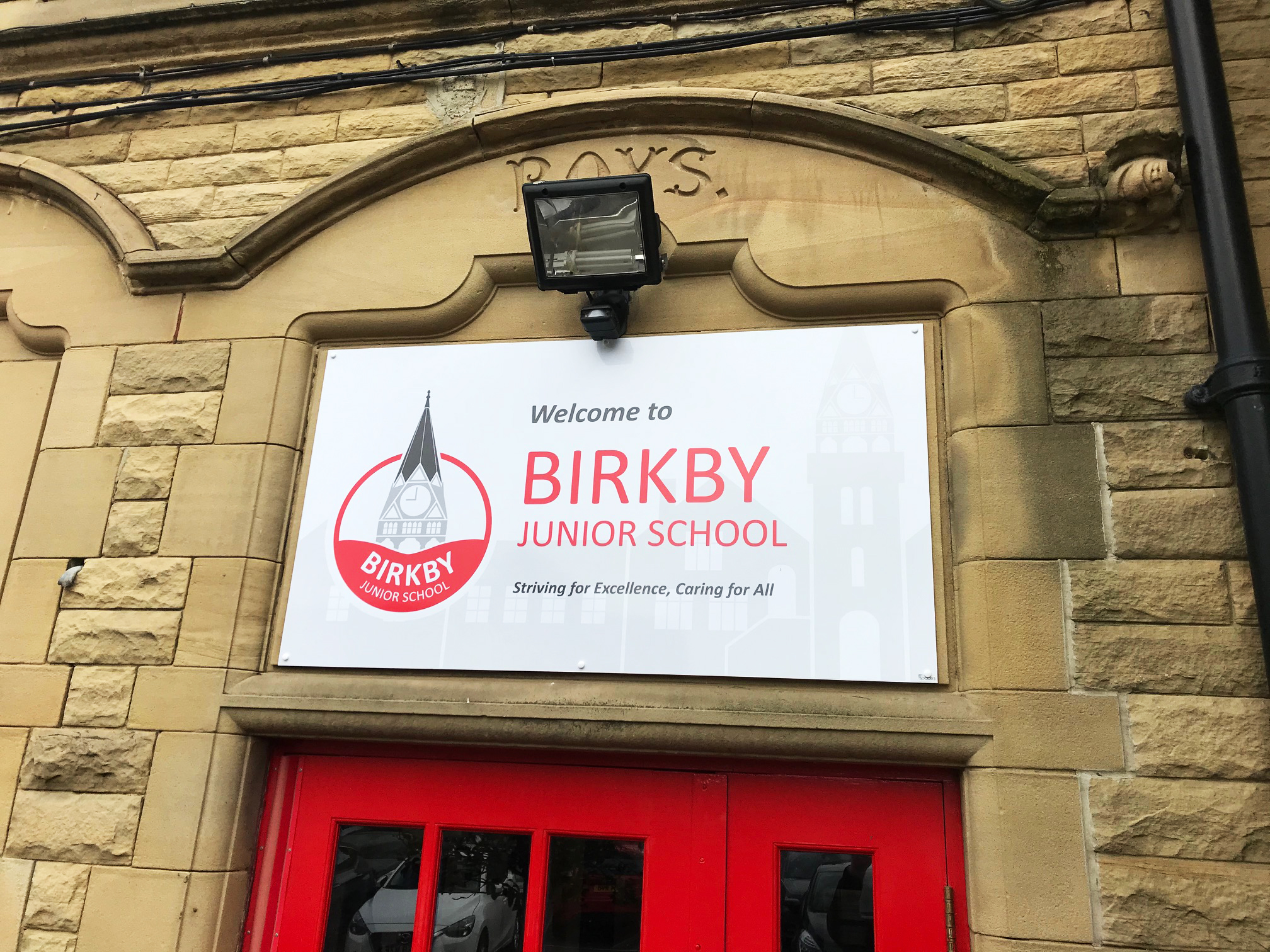
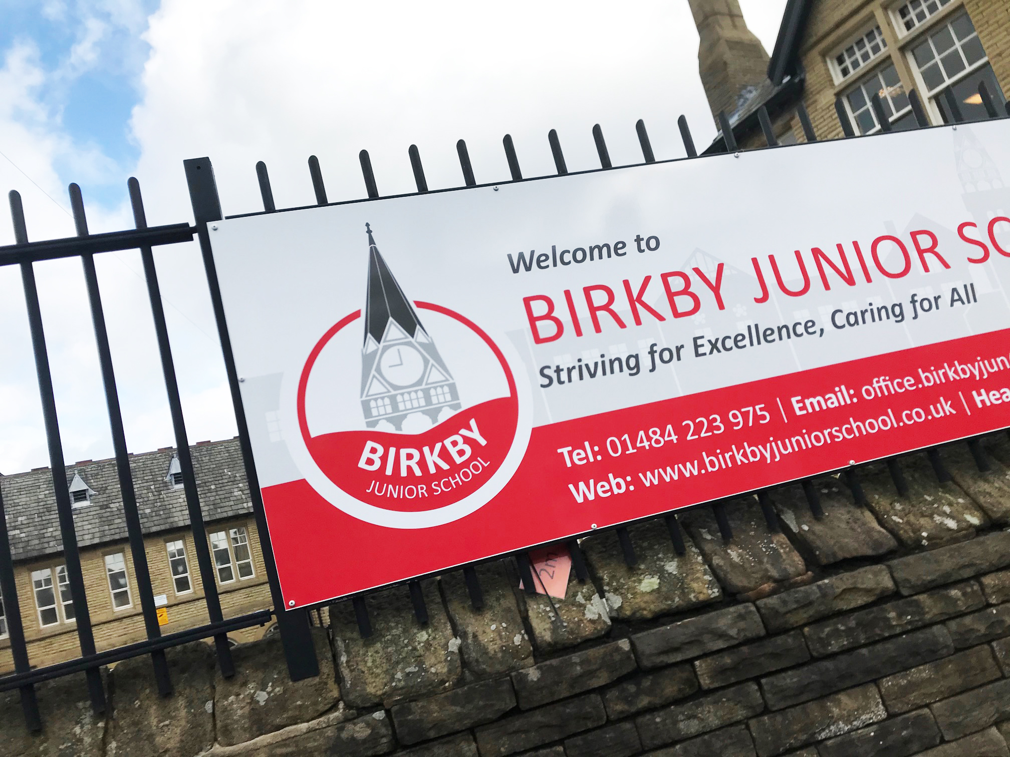
The logo is simple, making the school name clear and readable with modern grey icon of the clocktower above. The logo is easy to transfer to items like school jumpers and polo shirts and is eye-catching from a distance on signage.

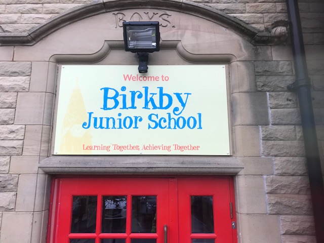
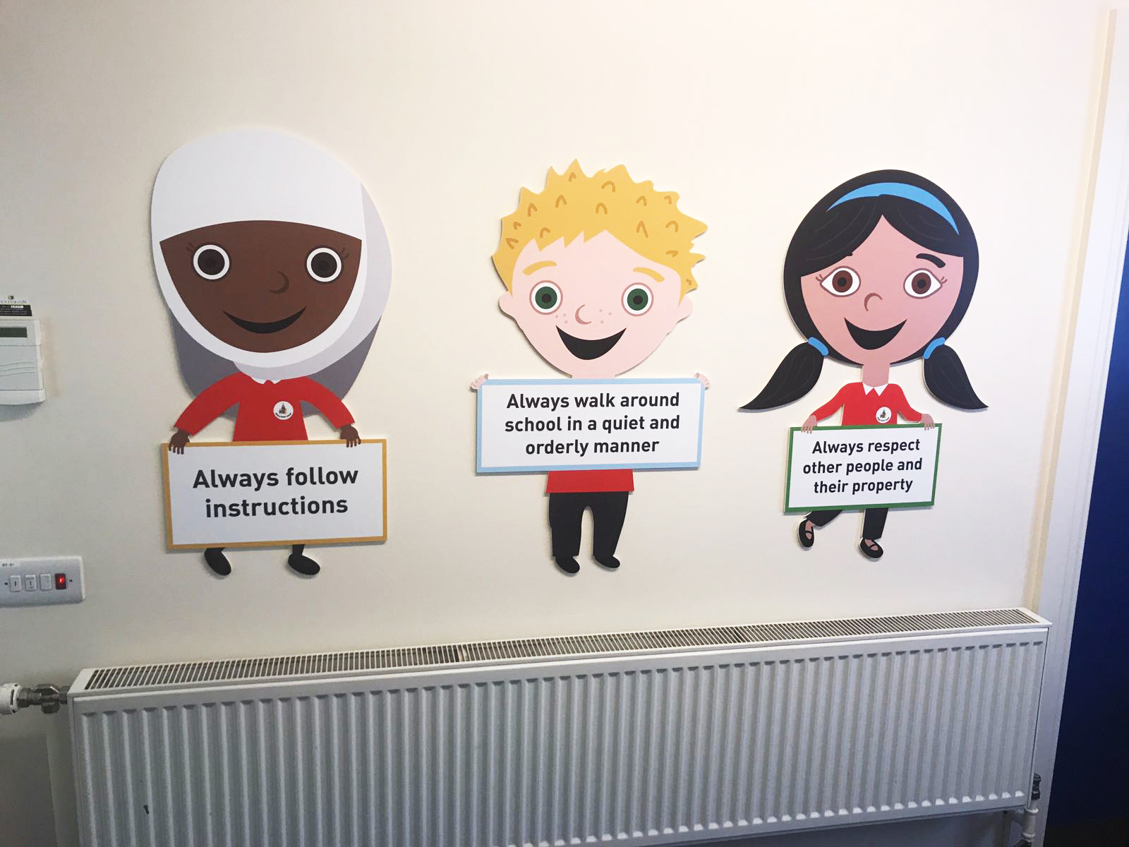
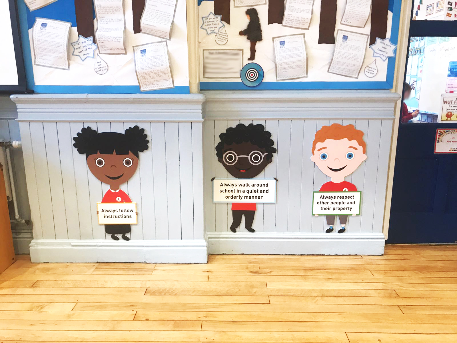
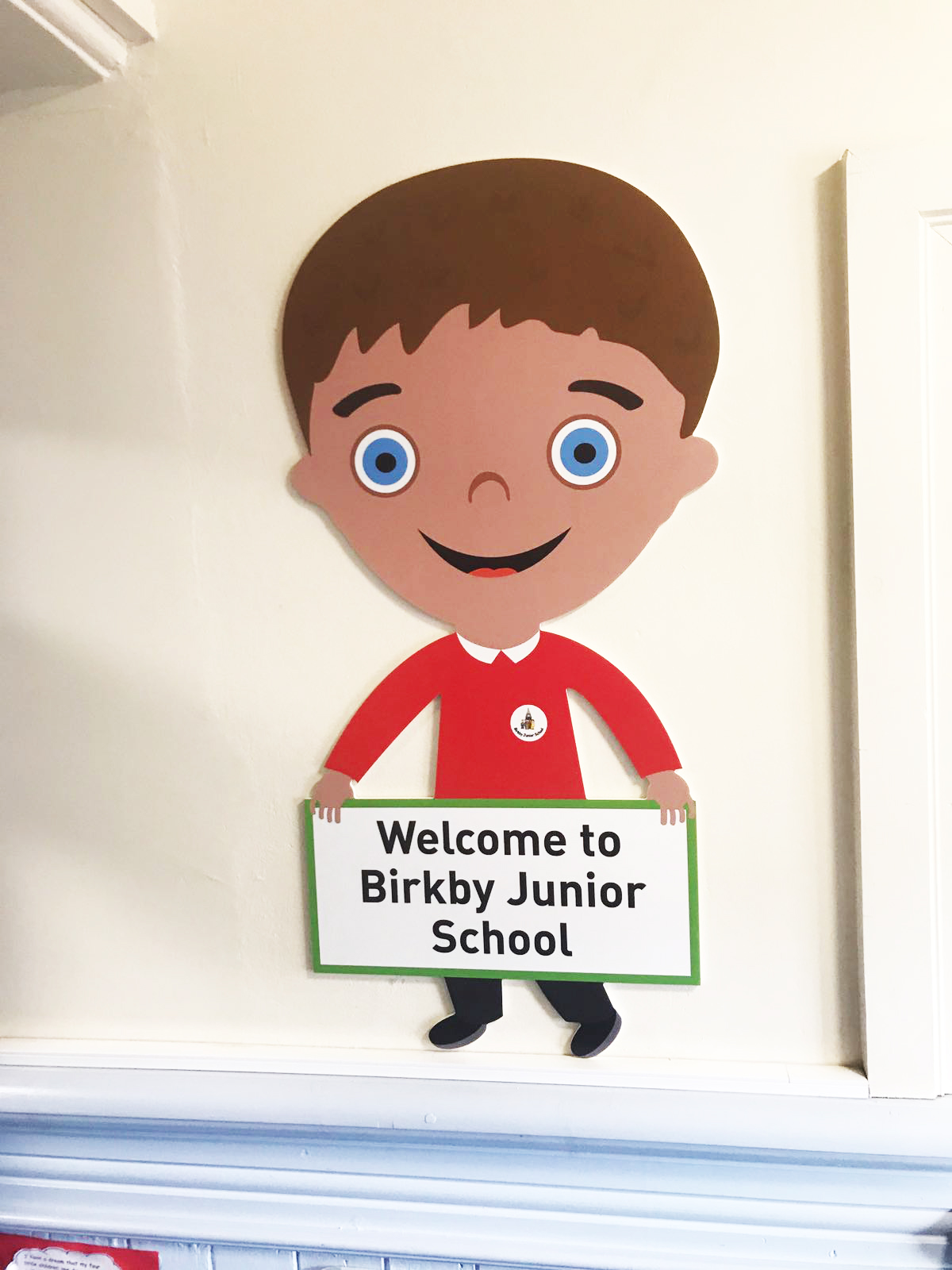
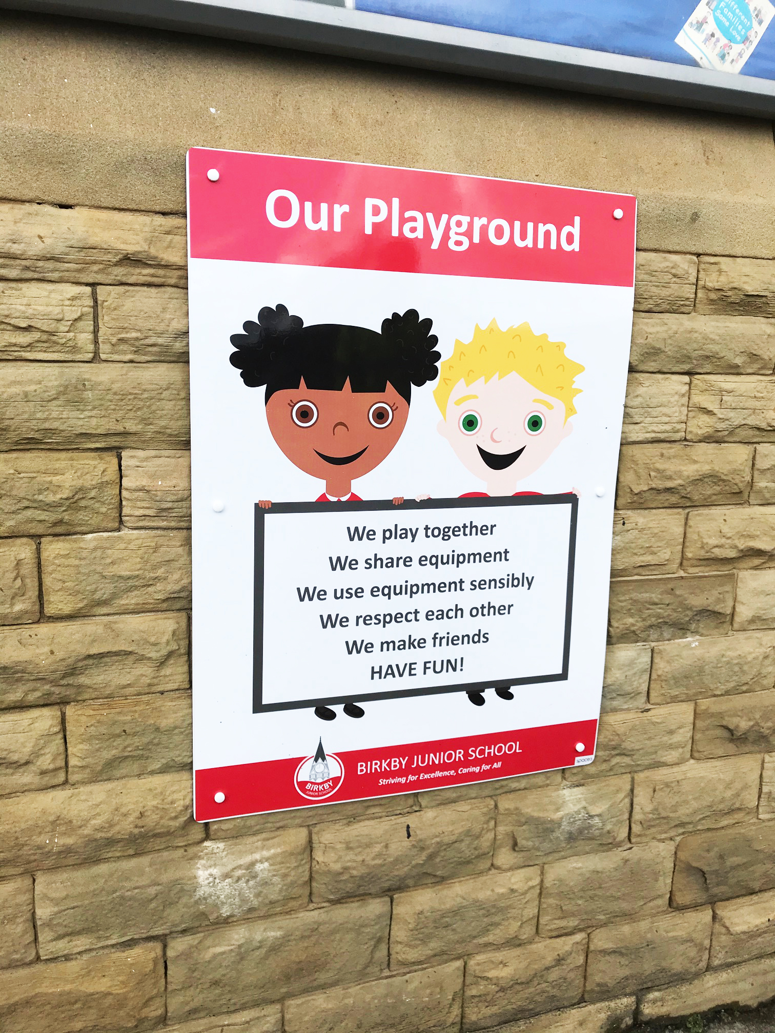
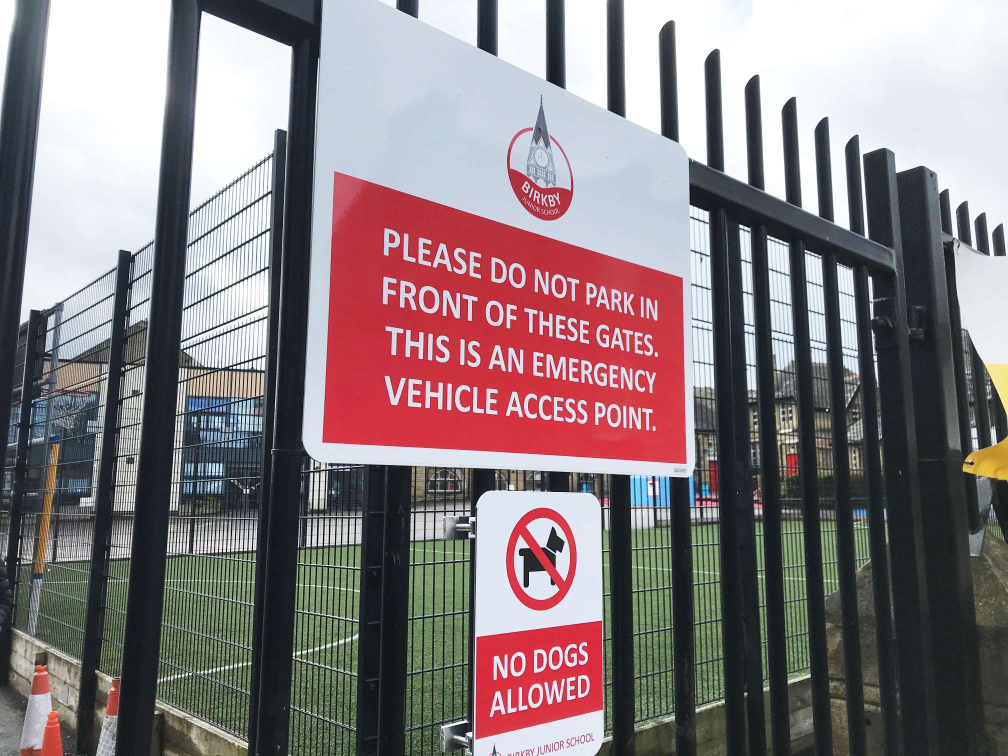
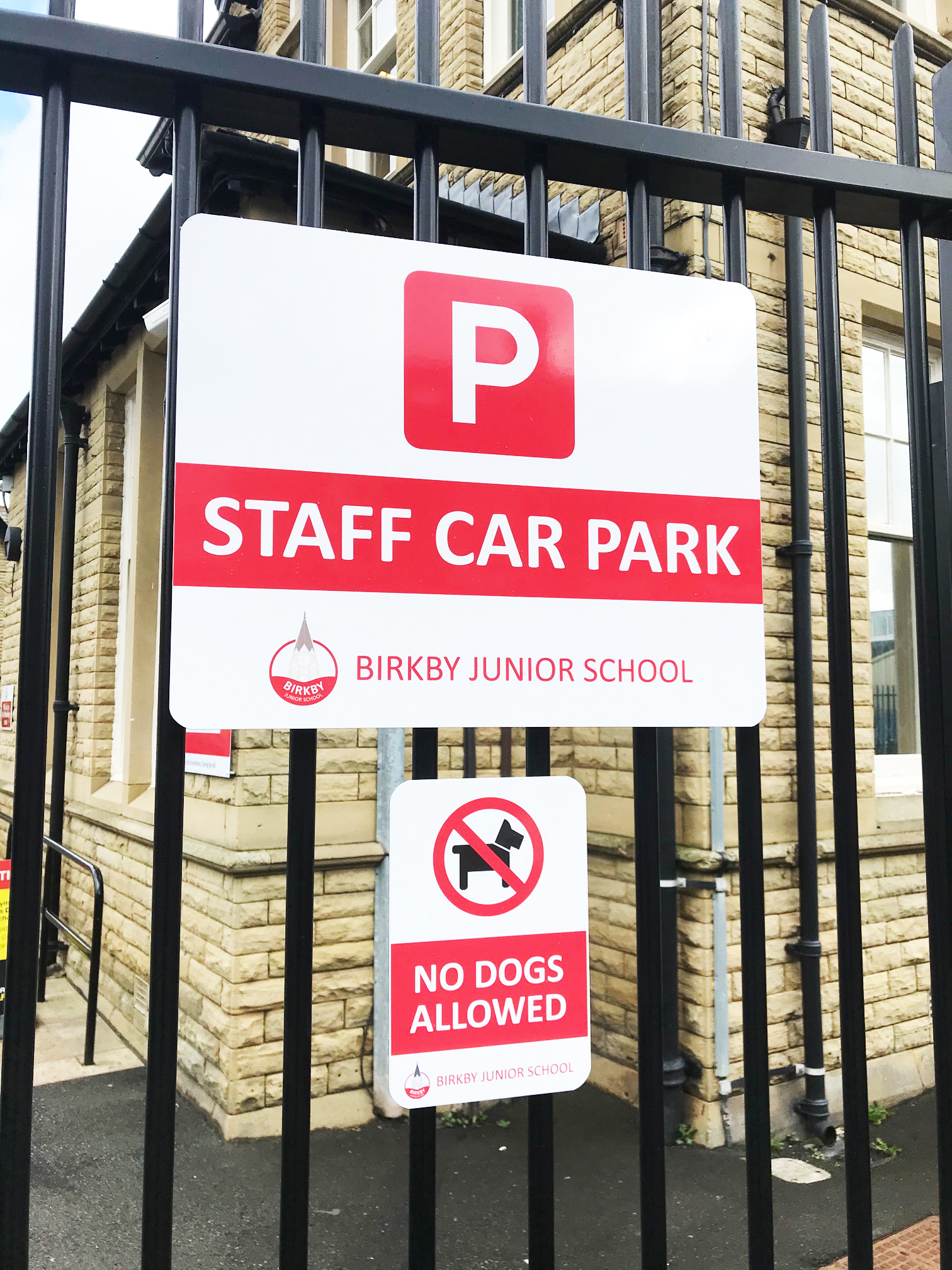
After the logo was designed and the customer was happy with it we moved on to designing the signage for the school. The school required a complete revamp of the outside signage and some new school vision and values inside too. To the right you can see the new signage compared to the old signage which was old fashioned and lacking in any kind of school identity.
